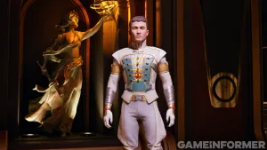
Redesigning Portal: Valve’s Artist Speaks
Designing a character for a game is no easy task. Even little nuances such as a character's shoes or hairstyle can affect how players perceive their hero. Redesigning a character brings additional challenges because players already have a set of expectations for established characters. Designers will go through hundreds of concepts before settling on a final design for their character. Valve's concept artist, Matt Charlesworth, explains how that process is working for Portal 2.
From The Beginning
“We sort of agreed that as a character Chell was really successful in the first Portal. She fit into the world really well and complemented it without the distractions that a more flashy character would bring. She served a utilitarian purpose for that game, but at the same time when we started out on Portal 2 we weren't sure if we wanted to bring her back. So we explored a few other characters before returning to Chell.
“Right from the beginning, we were constrained to replicate the character that was in the first game. Later on, we decided that we were probably missing a trick by not having Chell present, so we moved her back into that role. We were trying to do different things. Some of the images started with a sporty look – almost like motorcycle gear. Very different from the first aesthetic, even though we were still going for clean and simple. We were playing around with proportion as well, trying to play a lot more with extreme feminine proportions and a totally different color scheme.
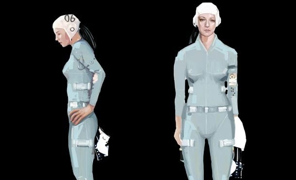
“We explored changing Chell’s nationality for a little bit. Nobody really knew what Chell was in the first game. She kind of had a hint of Japanese ethnicity to her, but we were still not quite sure if we were going to keep her or make her a new character. In the end, the things that were successful were the more minimal, clean, utilitarian looks. Nothing was on there for fashion. The constraints we had were that this girl was supposed to be dressed by machines, so any markings on the suit would have been on there for readability by the computer. She was never supposed to look as if she'd been designed. But that's something we fought with – to make her still appealing to the player, but not look over designed. Anything that doesn't serve a real purpose on the character tends to get cut.
Throwing Out Ideas
“We played around with some different machine-read imagery, and what extra things you might have on a suit like this, but we’re leaning away from the bar code design now, because it seems like it's been done quite a bit before, and originality is something I really associate with Portal.
“The stuff that was more successful was the really minimal approach, and that's sort of led us to this concept. This just seemed to strike a chord with everyone, because it really seemed like it belonged in the Portal world. It made her look physically capable, but at the same time, there is a vulnerability about her. That's what is attractive to everybody.
“The 06 is an arbitrary graphic put on there. We're trying to de-humanize the character a little bit. That's something that was continually coming up with some of the other concepts suited to the prisoner number system – that constant dehumanization of these test subjects."
Work In Progress
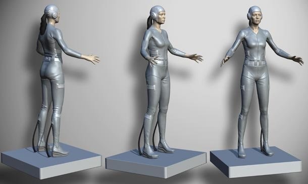
“This is not supposed to look like a sexy Marvel superhero suit. It’s supposed to look like it was designed without any thought of making her look attractive. We don't want to make her be unattractive, but we want to balance that out. Chell is a test subject, so she should look like one. Not a prisoner or a janitor or something. We also want people to remember the character this time around. Before I started working on Portal 2, I barely remembered the character from the first game
“The hat came up sort of halfway through the concepting phase. It just seemed to strike a chord with everyone. It's something that always makes me think of test pilots – people who were subjected to testing and extreme conditions. It serves a second purpose too, because if there's a graphic on it that's constantly readable from all angles then there can be graphics on the hat that are trackable by the computers in the world. That sort of serves the fiction of her being tested by GLaDOS. Also it keeps the hair out of her eyes.
“We’re still not entirely sure what we're doing with the spring heels. They were always something that was in Portal 1, and some of us are attached to them, and some of us aren't, so I’ve experimented with how we can do with them right this time around, and how we would go about replacing them. Everything should look 10 times better than the first Portal, that's the goal.”
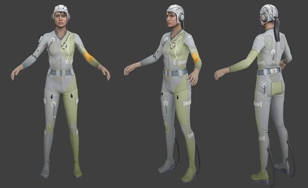
Valve's Tristan Reidford is the artist working on designing the game's co-op bots
Designing For Two
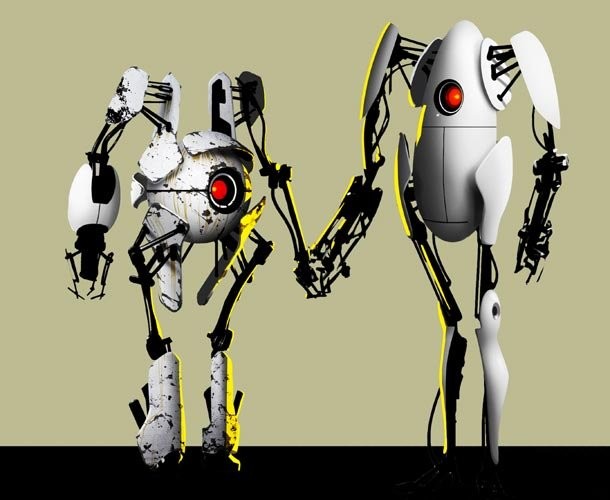
“We went through a phase of putting stuff up and deciding what the direction was. The co-op bots, at the very beginning our concepts had a very Westworld feel. We wanted them to look human, but feel robotic. They eventually developed into being these far more graphic, very industrial looking robots. We took turrets and the personality spheres and integrated them into the designs. There's so much personality in Portal that we thought we could almost tell a story with their design and get more use out of the art than we already had.
“We drew them holding hands because it just kind of describes the whole co-op idea, if slightly tongue-in-cheek. Portal’s got a sense of humor. It's quirky, but it shows that one of the biggest things that is important to Portal 2 will be that you're playing with a friend. It's one of those weird things, where somebody just kind of did it, and we had the sort of team moment where we were like “yeah that’s pretty cool.”
Popular Content
Get the Game Informer Print Edition!
Explore your favorite games in premium print format, delivered to your door.
- 10 issues per year
- Only $4.80 per issue
- Full digital magazine archive access
- Since 1991